主题
设计器属性面板配置
设计器属性面板配置用于定义组件属性如何在设计器的属性面板中显示。
显示属性面板时,属性面板从当前选中的组件上读取属性,并显示在属性面板上。用户操作属性面板的属性后,属性值会存储到组件的元数据中。
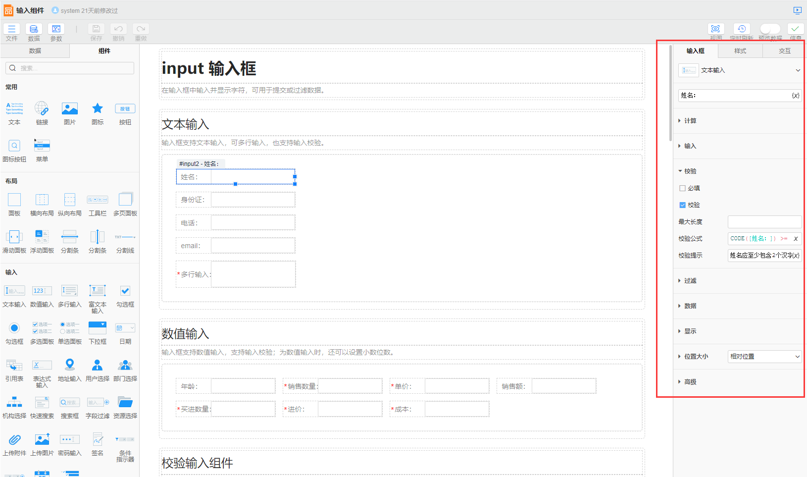
一些组件属性有专有数据格式,如fill类型的属性,它的值类型为FillInfo,需要使用属性类型为fill属性栏组件设置。
用户可以采用三种方式配置属性:
json
{
  "ppteditor": {
    "style": [
      "compStyle",// 预置属性
      {// 自定义属性
        "propertyName": "fill",
        "propertyType": "fill",
        "pictureFillTypes": "normal",
        "defaultImageCategory": ["texture"],
      },
      "@paddingMarginGroup",// 预置属性组
      {// 预置属性组,排除其中的triggerOn属性
        "propertyName": "@tooltipGroup",
        "excludes": ["triggerOn"]
      },
      {// 自定义属性组
        "propertyName": "animationGroup",
        "propertyType": "group",
        "items": [
          "animationEnabled",// 预置属性
          {// 自定义属性
            "propertyName": "animationDuration",
            "propertyType": "spinner",
            "visibleCondition": "animationEnabled"
          },
        ]
      }
    ]
  }
}
属性配置
所有属性类型都有一些通用配置:
json
{
    "propertyName": "<property name>",
    "propertyType": "<property type>",
    "keyPrefix": "<key prefix>",
    "visibleCondition": "<visible condition>",
    "caption": "<caption>",
    "showCaption": true|false,
    "captionPosition": "<caption position>"
}
propertyName
属性名称,对应属性配置中的属性名称。当显示或修改属性面板属性时,会从组件上读取或写入对应的属性。
catalog
属性分类,对应属性配置中的属性分类。一个分类中包含多个属性时可将属性放入一个容器属性中在容器上配置分类,容器内的属性会自动继承容器的分类。
propertyType
属性类型。属性类型分为两大类:布局属性和输入属性。布局属性用于将属性分组显示,输入属性将输入值设置到组件上。
keyPrefix
国际化前缀,用于自动获取属性的标题、占位符等。(TODO link文档:国际化的作用和使用方法)通常无需配置,自动获取属性标题时确定。
- 标题:根据属性名的泛用性可在国际化文件中通过以下四种格式指定标题,自动获取标题时会按照以下顺序获取:
property.组件类型.catalog.propertyName:属性在当前组件当前分类下有特定的名称。如 TODOproperty.组件类型.propertyName:属性在当前组件中有特定的名称,如property.kpi.layout=排列布局。property.catalog.propertyName:属性在当前类别中有特定的名称,如 TODOproperty.propertyName:属性在各种场景下统一的名称,如property.fill=填充。
- 占位符:可通过
keyPrefix.placeholder的格式指定。如property.link.placeholder=请输入链接。 - 下拉框的每个选项:
- 标题:可通过
keyPrefix.value指定每个选项的标题。如property.visible.condition=条件。 - 描述:可通过
keyPrefix.value.desc指定每个选项的描述。如property.visible.condition.desc=条件表达式(TODO 暂无合适例子)。
- 标题:可通过
visibleCondition
属性显示条件,采用条件表达式语法,用于根据组件状态动态计算每个属性是否显示。默认始终显示。
caption
属性标题,配置后根据captionPosition显示在属性的左侧或上侧,默认通过国际化前缀自动获取。
showCaption
是否显示属性标题,默认显示。
captionPosition
属性标题的位置,默认为left。
left,标题在属性的左侧,与属性同行显示。top,标题在属性的上侧,与属性分为两行显示。如输入框内容较长时可将标题设置为上方,输入框可在第二行整行显示。
属性类型
容器
group
分组。分组下级属性的可随分组收起折叠。
属性配置
items,分组下级的属性数组。expandVisible,是否展示分组的展开按钮,点击展开按钮可切换展开/收起状态,默认最外层分组显示展开按钮。expand,分组默认是否展开。默认false。
示例

json
{
  "propertyName": "seniorGroup",
  "propertyType": "group",
  "items": [
    {
      "propertyName": "id",
      "propertyType": "expEdit",
    },
    {
      "propertyName": "name",
      "propertyType": "expEdit",
    },
  ]
}
rowGroup
行分组。行分组下的属性会显示在同一行。
属性配置
items,分组的下级属性数组。expandVisible,是否展示切换展开状态的按钮,captionPosition设置为top时生效,默认为true。expand,分组默认是否展开。默认true。
示例

json
{
  "propertyName": "collapseGroup",
  "propertyType": "rowGroup",
  "items": [
    {
      "propertyName": "collapsed",
      "propertyType": "checkbox",
    },
    {
      "propertyName": "collapsedRowCount",
      "propertyType": "spinner"
    }
  ]
}
tabbar
选项卡,用于在属性较多时将属性分页显示。tabbar只能用在顶级,配置后显示在属性栏的最上方,选中每个选项时会在选项卡下方展示对应的属性页。
属性配置
示例

json
{
  "propertyType": "tabbar",
  "tabs": [
    {
      "keyPrefix": "property.basic",
      "items": []
    },
    {
      "keyPrefix": "property.title",
      "catalog": "title",
      "items": []
    },
    {
      "keyPrefix": "property.table",
      "items": []
    },
    {
      "keyPrefix": "property.columns",
      "catalog": "dataDefinitions",
      "items": []
    }
  ]
}
accordion
手风琴,用于将多份结构相近的属性展示在不同琴键中,同一时间只展示一个琴键下的属性,展开另一琴键时会自动收起上一个展开琴键。通常手风琴单独作为一页展示。手风琴分为静态手风琴和动态手风琴:
- 静态手风琴:琴键数量和名称固定的手风琴。如柱形图的坐标轴手风琴,固定包含x轴、y1轴、y2轴三个琴键。
- 动态手风琴:琴键数量与名称需要动态获取的手风琴。如柱形图需要根据系列的数量分别展示对应的琴键,编辑每个系列的属性。动态手风琴的琴键信息通过TODO获取。
属性配置
parts,手风琴的琴键,静态手风琴需要配置。items,每个琴键内包含的属性数组,动态受父亲需要配置。
示例
- 静态手风琴

json
{
  "propertyName": "axis",
  "propertyType": "accordion",
  "parts": [{
    "catalog": "xAxis",
    "items": []
  }, {
    "catalog": "y1Axis",
    "items": []
  }, {
    "catalog": "y2Axis",
    "items": []
  }]
}- 动态手风琴
json
{
  "propertyName": "axis",
  "propertyType": "accordion",
  "items": []
}
输入
checkbox
勾选框。
示例

json
{
"propertyName": "dragEnabled",
"propertyType": "checkbox"
},
{
"propertyName": "zoomEnabled",
"propertyType": "checkbox"
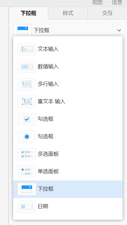
}combobox
下拉框。
属性配置
items,下拉框的可选项。- 字符串数组:配置每个选项选中后的属性值,选项的标题与描述信息通过国际化前缀自动获取。
- JSON数组:
caption,选项的标题。value,选中选项时的属性值。desc,选项的描述,在标题的后方以灰色的文字显示。
pptItems,下级属性数组,配置后下拉框下方可展示下级属性,参考分组的items。previewable,是否支持预览,为true时鼠标移入每个选项会在组件展示修改后的效果,默认false。itemDescVisible,是否在选项中显示描述文字,描述通过国际化前缀自动获取,默认true。cleanIconVisible,是否显示清空已选项的按钮,默认false。multipleSelect,是否支持多选,默认false。selectAllEnabled,是否显示“全选”选项,multipleSelect为true时生效,默认false。selectAllValue,全选了所有选项时的属性值,multipleSelect为true时生效,默认*。emptySelectAllEnabled,没有选项时,是否显示全选勾选框,selectAllEnabled为true时生效,默认false。arbitraryInputEnabled,是否支持在下拉框输入任意值,配置true时可选项会作为输入提示。默认false。
示例
- 单选下拉框

json
{
  "propertyName": "visible",
  "propertyType": "combobox",
  "items": ["true", "false", "condition"]
}
json
{
  "propertyName": "visible",
  "propertyType": "combobox",
  "items": [{
    "caption": "显示",
    "value": "true"
  }, {
    "caption": "隐藏",
    "value": "false"
  }, {
    "caption": "条件",
    "value": "condition"
  }]
}
多选下拉框 TODO
可输入下拉框 TODO
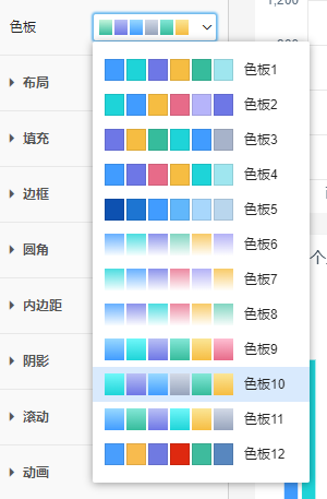
colorPaletteCombobox
色板下拉框。
示例
json
{
  "propertyName": "colorPalette",
  "propertyType": "colorPaletteCombobox"
}
componentsCombobox
组件下拉框。
配置
includeTypes,组件类型数组,限定只能选哪些组件类型的组件。默认为null,表示不做限制。excludeTypes,排除的组件类型数组,限定不能选哪些组件类型的组件。默认为null,当配置了includeTypes和excludeTypes时,以includeTypes为准。selectChildrenOnly,是否只能选择当前组件的下级组件。默认为false。只有容器类组件设置才有效。includeSelf,是否能选择当前组件。默认为false。multipleSelectEnable,是否能够多选。默认为false。selectAllEnable,是否显示全选勾选框。默认为false。selectAllText,全选时的文字。默认为"全选"。selectAllEnable为true时生效。selectAllValue,全选时的值。默认为"*"。selectAllEnable为true时生效。不传递这个参数,全选后,下拉框的值仍然是所有选项值的数组。传递这个参数,全选后,下拉框的值总是这个全选值形成的数组,例如["*"]。filterTypes,过滤类型数组,默认为null。指定此项后,includeTypes和excludeTypes不生效。一般使用includeTypes和excludeTypes即可,但某些场景可能还需要更细致的限制,比如:提交表单数据范围为勾选的,只能选择具有勾选属性的组件,数据范围切换为高亮的时,只能选择具有选中属性的组件。因此提供一些过滤类型来覆盖这些复杂需求,目前支持的过滤类型有:filterIndicatorComponent,配置了supportShowOnFilterIndicator属性的组件。比如:条件指示器指示条件属性只能使用有该配置属性的组件。conformedDimensionComponent,和当前组件具有一致性维度的组件。比如:仪表板自动过滤选择组件时,只能选择与当前组件具有一致性维度的组件。dataComponent,数据类组件,数据类组件具有$selectedRows或$checkedRows属性。比如:更新数据交互数据范围选择勾选的或高亮的时,要选择一个数据类的组件。数据类的组件目前有列表、浮动面板等。
示例
- 能够选择所有组件。
json
{
    "propertyName": "targetComponent",
 	  "propertyType": "componentsCombobox"
}- 只能选择对话框组件。
json
{
    "propertyName": "dialog",
    "propertyType": "componentsCombobox",
    "includeTypes": ["dialog"]
}- 只能选择当前选中组件的下级勾选框组件。
json
{
    "propertyName": "checkboxComp",
    "propertyType": "componentsCombobox",
    "inclueTypes": ["checkbox"],
    "selectChildrenOnly": true
}- 能选择除
canvas组件的其余类型组件。
json
{
    "propertyName": "targetComponent",
    "propertyType": "componentsCombobox",
    "excludeTypes": ["canvas"]
}- 能在条件指示器中显示的组件。
json
{
    "propertyName": "targetComponent",
    "propertyType": "componentsCombobox",
    "filterTypes": ["filterIndicatorComponent"]
}- 自动过滤时选择具有一致性维度的组件。
json
{
    "propertyName": "targetComponent",
    "propertyType": "componentsCombobox",
    "filterTypes": ["conformedDimensionComponent"]
}- 更新数据交互中选择数据类组件。
json
{
    "propertyName": "targetComponent",
    "propertyType": "componentsCombobox",
    "filterTypes": ["dataComponent"]
}
districtLevelCombobox
GIS地图的区块层级下拉框。
示例
TODO 截图
json
{
  "propertyName": "districtLevel",
  "propertyType": "districtLevelCombobox",
}
extensionCombobox
扩展下拉框。
属性配置
extensionType,扩展类型,必须配置,配置后下拉框可选项中置会显示指定类型的扩展信息。
实例
TODO 截图
json
{
  "propertyName": "mapExtension",
  "propertyType": "extensionCombobox",
  "extensionType": "map"
}
resourceCombobox
资源下拉框。
属性配置
includeTypes,文件类型数组,配置后资源下拉框可选项中只会显示指定类型的文件。
示例
- 所有类型资源
json
{
  "propertyName": "resPath",
  "propertyType": "resourceCombobox"
}- 只选择dash资源
json
{
  "propertyName": "resPath",
  "propertyType": "resourceCombobox",
  "includeTypes": ["dash"]
}
compTypeCombobox
组件类型下拉框。
属性配置
compCategory,组件分类,如input、chart。
示例
json
{
"propertyName": "inputType",
"propertyType": "compTypeCombobox",
"compCategory": "input"
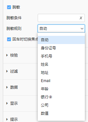
}maskRuleCombobox
脱敏规则下拉框。
示例
json
{
  "propertyName": "maskRule",
  "propertyType": "maskRuleCombobox"
}
patternCombobox
匹配模式下拉框。
属性配置
conditionFieldName,条件字段属性名,匹配模式根据条件字段可展示不同选项。
示例
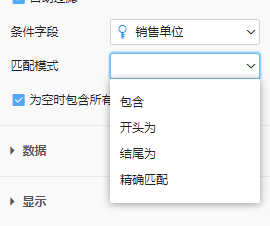
json
{
  "propertyName": "pattern",
  "propertyType": "patternCombobox",
  "conditionFieldName": "conditionField"
}
itemFilterExpEdit
维项过滤表达式输入框。
示例
json
{
  "propertyName": "itemFilter",
  "propertyType": "itemFilterExpEdit"
}
spinner
数值微调组件。
属性配置
min,最小值,默认无最小限制。max,最大值,默认无最大限制。step,每次点击微调按钮数值的变化单位,默认为1。suffix,用于固定显示在数字后的后缀,默认不显示后缀。如设置字体大小时可以带上后缀"px",更直观。validateRegExp,用于限制输入内容的正则表达式,默认限制为:只能输入数字、范围在min、max之间且小数位数不多于step的位数。
示例

json
{
  "propertyName": "offsetX",
  "propertyType": "spinner",
  "suffix": "px"
}
资源选择
按钮
iconButton
图标按钮组件。
属性配置
categories,可选择的图标分类,默认全部分类图标都可选。
示例
json
{
  "propertyName": "icon",
  "propertyType": "iconButton"
}
colorButton
颜色按钮组件。
属性配置
gradientColorVisible,是否提供渐变色选择,默认可选择渐变色。
示例
json
{
  "propertyName": "iconColor",
  "propertyType": "colorButton"
}
编辑框
viewValidateInfo
查看模型校验规则组件,用于在设计器中快捷查看对应字段所在模型上设置的校验规则。 该组件不产生任何属性信息,仅用于查看校验规则。
示例
json
{
  "propertyName": "viewValidateInfo",
  "propertyType": "viewValidateInfo",
  "showCaption": false
}
validateRules
设置更多校验组件。
示例
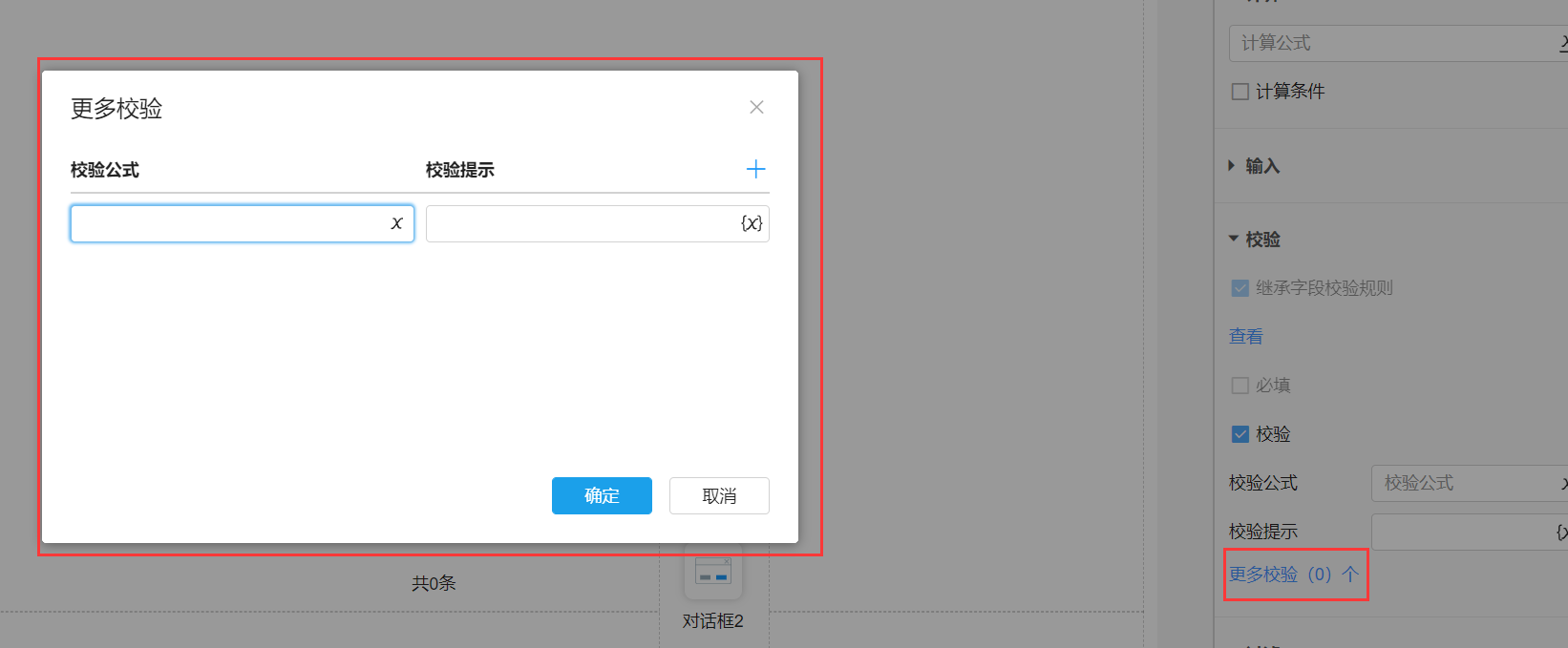
json
{
  "propertyName": "validateRules",
  "propertyType": "validateRules"
}
样式
border
边框,参考css的border,可分别设置上下左右边框的类型、颜色与宽度。
示例

json
{
  "propertyName": "border",
  "propertyType": "border"
}
cellBorder
单元格边框,参考excel的边框,可分别设置上下左右和内外边框的类型、颜色与宽度。
示例

json
{
  "propertyName": "border",
  "propertyType": "cellBorder"
}
borderRadius
圆角。
示例

json
{
  "propertyName": "borderRadius",
  "propertyType": "borderRadius"
}
fill
填充。属性类型为fill。
属性配置
fillTypes,填充类型。默认为:["none","color","picture","animationEffect"]。none,无填充。color,颜色填充,可选择纯色或渐变色。picture,图片填充。animationEffect,动效填充。使用JS代码渲染的动态背景填充效果。可以通过动效填充扩展增加自定义动效填充。auto,自动。常见于系统内置的图形组件。图形组件可以选择色板,系列按色板中定义的颜色按顺序填充,当没有对系列做自定义颜色填充时,颜色填充的填充类型为自动,表示继承色板颜色。不同的属性对自动的处理方式不同。inherit,继承上级。用于旭日图等有多级数据,下级使用上级填充的场景。inheritGradient,继承上级渐变。用于旭日图等有多级数据,下级在上级填充的基础上渐变的场景。
gradientColorEnabled,颜色填充是否可选择渐变色,默认true。pictureFillTypes,图片填充可选择的填充方式,参考css的background-size。默认为all。original,原始大小。stretch,拉伸。cover,充满容器。contain,适合于容器。repeat,平铺。clip,切片。常用于设置不规则边框的背景,能够适应组件大小变化且边框拉伸不变形。- 快捷配置:
normal,不包含切片的填充方式:["original", "stretch", "cover", "contain", "repeat"]。all,所有填充方式。
defaultImageCategory,图片填充可选择的图片分类。系统预置图片和用户上传图片可以选择图片分类,属性设置可以只显示其中某些分类的图片,默认可以选择所有分类图片。canvasBackground,画布背景,适用于整个页面的背景图片。containerBackground,容器背景。titleBackground,标题背景。borderBackground,边框背景,对于一般组件,可以指定此值。chartBackground,图表背景。texture,纹理背景。cellBackground,单元格背景。placeholderBackground,占位背景。illustration,插图。
示例
- 组件背景填充
一般组件背景填充,只需要配置defaultImageCategory。
json
{
  "propertyName": "fill",
  "propertyType": "fill",
  "defaultImageCategory": ["borderBackground"]
}- 图形系列填充
系列填充只能使用纹理图片,且不支持切片。
json
{
  "propertyName": "fill",
  "propertyType": "fill",
  "pictureFillTypes": "normal",
  "defaultImageCategory": ["texture"],
}
TODO 截图
- 图片填充使用切片
使用切片将背景图片切分,实现边框拉伸且不变形的效果。
TODO 截图
font
字体。
属性配置
gradientColorEnabled,是否可选择渐变色作为字体颜色,默认true。underlineEnabled,是否可调整下划线的有无,默认true。lineThroughEnabled,是否可调整删除线的有无,默认true。
示例
TODO 截图
json
{
  "propertyName": "font",
  "propertyType": "font"
}
icon
图标。属性类型为icon。
属性配置
gradientColorEnabled,是否可选择渐变色作为svg图标的颜色,默认true。categories,可选择的图标分类。用户上传图片时可以选择图标分类,系统预置图标也包含分类信息,属性设置可以只显示其中某些分类的图标,默认可以选择所有图标。
示例
TODO 截图
json
{
  "propertyName": "icon",
  "propertyType": "icon"
}
line
线条。属性类型为line。
示例
TODO 截图
json
{
  "propertyName": "line",
  "propertyType": "line"
}
padding
内边距。参考css的padding。
示例
TODO 截图
json
{
  "propertyName": "padding",
  "propertyType": "padding"
}
textAlign
文本水平对齐,参考css的text-align。
示例
TODO 截图
json
{
  "propertyName": "textAlign",
  "propertyType": "textAlign"
}
verticalAlign
文本垂直对齐,参考css的vertical-align。
示例
TODO 截图
json
{
  "propertyName": "verticalAlign",
  "propertyType": "verticalAlign"
}
shadow
阴影,参考css的box-shadow。
属性配置
type,类型,默认outset。inset,内阴影。outset,外阴影。
spreadEnabled,是否支持设置阴影的扩展,默认true。
示例
- 外阴影
TODO 截图
json
{
  "propertyName": "shadow",
  "propertyType": "shadow"
}- 内阴影
TODO 截图
json
{
  "propertyName": "innerShadow",
  "propertyType": "shadow",
  "type": "inset"
}
预置属性
预置属性是系统默认配置好的属性配置,通过属性名引用。
inputTitle
输入组件标题。
TODO 截图
json
{
  "propertyName": "title",
  "propertyType": "expEdit"
}
compStyle
选择组件风格。
TODO 截图
json
{
  "propertyName": "compStyle",
    //TODO 待确认propertyType
  "propertyType": "themeSelector"
}
animationEnabled
是否启用动画效果。
TODO 截图
json
{
  "propertyName": "animationEnabled",
  "propertyType": "checkbox"
}
animationDelay
动画延迟时间。
TODO 截图
json
{
	"propertyName": "animationDelay",
	"propertyType": "spinner",
	"min": 0
}
animationRandom
是否随机开始动画。
TODO 截图
json
{
	"propertyName": "animationRandom",
	"propertyType": "checkbox"
}
offsetX
水平像素偏移。
TODO 截图
json
{
	"propertyName": "offsetX",
	"propertyType": "checkbox",
	"suffix": "px"
}
offsetY
垂直像素偏移。
TODO 截图
json
{
	"propertyName": "offsetY",
	"propertyType": "checkbox",
	"suffix": "px"
}
conditionStyles
编辑组件条件样式。
TODO 截图
json
{
		"propertyName": "conditionStyles",
    //TODO 待确认propertyType
		"propertyType": "conditionList"
}
colorPalette
选择色板。
json
{
  "propertyName": "colorPalette",
  "propertyType": "colorPaletteCombobox"
}
border
边框。
json
{
  "propertyName": "border",
  "propertyType": "border"
}
borderRadius
圆角。
json
{
  "propertyName": "borderRadius",
  "propertyType": "borderRadius"
}
fill
填充
TODO 截图
json
{
  "propertyName": "fill",
  "propertyType": "fill"
}
font
字体。
TODO 截图
json
{
  "propertyName": "font",
  "propertyType": "font"
}
icon
图标。
TODO 截图
json
{
  "propertyName": "icon",
  "propertyType": "icon"
}
line
线条。
TODO 截图
json
{
  "propertyName": "line",
  "propertyType": "line"
}
padding
内边距。
TODO 截图
json
{
  "propertyName": "padding",
  "propertyType": "padding"
}
margin
外边距。
TODO 截图
json
{
  "propertyName": "margin",
  "propertyType": "padding"
}
textAlign
文本水平对齐。
TODO 截图
json
{
  "propertyName": "textAlign",
  "propertyType": "textAlign"
}
verticalAlign
文本垂直对齐。
TODO 截图
json
{
  "propertyName": "verticalAlign",
  "propertyType": "verticalAlign"
}
inputType
输入组件分类切换。
json
{
  "propertyName": "inputType",
  "propertyType": "compTypeCombobox",
  "showCaption": false,
  "compCategory": "input"
}
autoFilter
自动过滤。
json
{
  "propertyName": "autoFilter",
  "propertyType": "checkbox"
}
toggleFocusOnEnter
回车时切换焦点。
json
{
  "propertyName": "toggleFocusOnEnter",
  "propertyType": "checkbox"
}
displayFormat
显示格式
json
{
  "propertyName": "displayFormat",
  "propertyType": "combobox",
  "type": "menu"
}
itemFilter
维项过滤。
json
{
  "propertyName": "itemFilter",
  "propertyType": "expEdit",
  "visibleCondition": "!!dataset"
}
calcExp
计算公式。
json
{
  "propertyName": "exp",
  "propertyType": "expEdit",
  "showCaption": false
}
maxLength
最大长度。
json
{
  "propertyName": "maxLength",
  "propertyType": "spinner",
  "visibleCondition": "!!validateEnabled"
}
fill_input
填充(输入组件填充,只能选择颜色填充与无填充)。
TODO fill类型配置不完善,待完善后补充。
json
{
  "propertyName": "fill",
  "propertyType": "fill",
}
fill_noClip
填充(小组件填充,图片填充时不能设置切片)。
TODO fill类型配置不完善,待完善后补充。
json
{
  "propertyName": "fill",
  "propertyType": "fill",
}
iconButton
图标。
json
{
  "propertyName": "icon",
  "propertyType": "iconButton",
  "showCaption": false
}
iconColor
图标颜色。
json
{
  "propertyName": "iconColor",
  "propertyType": "colorButton",
	"showCaption": false,
	"gradientColorVisible": true,
	"visibleCondition": "icon != null && ((icon@code !=null && icon@code != 'none') || (icon@image !=null && icon@image != 'none' && icon@image.endsWith('.svg')))"
}
iconSize
图标大小。
json
{
  "propertyName": "iconSize",
  "propertyType": "spinner",
  "showCaption": false,
  "visibleCondition": "icon != null && icon !='none' && icon@code !='none'"
}
contentAdjust
文字调整。
json
{
  "propertyName": "contentAdjust",
  "propertyType": "combobox",
  "items": ["no", "wrap"]
}
boxShadow
外阴影。
json
{
  "propertyName": "boxShadow",
  "propertyType": "shadow"
}
insetBoxShadow
内阴影。
json
{
  "propertyName": "insetBoxShadow",
  "propertyType": "shadow",
  "type": "inset"
}
textShadow
文字阴影。
json
{
  "propertyName": "textShadow",
  "propertyType": "shadow"
}
预置属性组
预置属性组是系统默认配置好的属性配置集合,通过@集合名称引用。
不同场景使用属性组时对组内的属性有不同的显示隐藏需求,可通过配置实现:
excludes,排除属性,指定属性名数组。override,覆盖属性,用指定的属性覆盖属性组的属性。visibleCondition,显示条件。
@visibleGroup
显示分组。
json
{
  "propertyName": "displayGroup",
  "propertyType": "group",
  "items": [
    {
      "propertyName": "visible",
      "propertyType": "combobox",
      "items": ["true", "false", "condition"]
    },
    {
      "propertyName": "visibleCondition",
      "propertyType": "expEdit",
      "visibleCondition": "visible === 'condition'"
    }
  ]
}
@positionGroup
SuperPage中的位置和大小分组。
@seniorGroup
高级分组。
@layoutGroup
仪表板中的布局分组。
@altitudeGroup
GIS地图图层中的高度分组。
@floatAltitudeGroup
GIS地图图层中的悬浮高度分组。
@paddingMarginGroup
内外边距分组。
json
{
  "propertyName": "paddingGroup",
  "propertyType": "group",
  "items": [
    {
      "propertyName": "padding",
      "propertyType": "padding"
    },
    {
      "propertyName": "margin",
      "propertyType": "padding"
    }
  ]
}
@displayGroup
显示分组。
json
{
  "propertyName": "displayGroup",
  "propertyType": "group",
  "items": [
    {
      "propertyName": "visible",
      "propertyType": "combobox",
      "items": ["true", "false", "condition"]
    },
    {
      "propertyName": "visibleCondition",
      "propertyType": "expEdit",
      "showCaption": false,
      "visibleCondition": "visible === 'condition'"
    },
    {
      "propertyName": "disable",
      "propertyType": "combobox",
      "items": ["true", "false", "condition"]
    },
    {
      "propertyName": "disableCondition",
      "propertyType": "expEdit",
      "showCaption": false,
      "visibleCondition": "disable === 'condition'"
    }
  ]
}
@inputDisplayGroup
输入组件显示分组。
json
{
  "propertyName": "displayGroup",
  "propertyType": "group",
  "items": [
    {
      "propertyName": "visible",
      "propertyType": "combobox",
      "items": ["true", "false", "condition"]
    },
    {
      "propertyName": "visibleCondition",
      "propertyType": "expEdit",
      "showCaption": false,
      "visibleCondition": "visible === 'condition'"
    },
    {
      "propertyName": "disable",
      "propertyType": "combobox",
      "items": ["true", "false", "readonly", "condition"]
    },
    {
      "propertyName": "disableCondition",
      "propertyType": "expEdit",
      "showCaption": false,
      "visibleCondition": "disable === 'condition'"
    },
    {
      "propertyName": "displayFormat",
      "propertyType": "combobox"
    },
    {
      // TODO 待expEdit类型配置完善后补充。
      "propertyName": "placeholder",
      "propertyType": "expEdit"
    }
  ]
}
@calcGroup
计算分组。
json
{
  "propertyName": "expGroup",
  "propertyType": "group",
  "expand": true,
  "items": [
    {
      "propertyName": "exp",
      "propertyType": "expEdit",
      "showCaptioin": false
    },
    {
      "propertyName": "calcConditionGroup",
      "propertyType": "rowGroup",
      "showCaption": "false",
      "items": [
        {
          "propertyName": "calcConditionEnabled",
          "propertyType": "checkbox"
        },
        {
          "propertyName": "calcCondition",
          "propertyType": "expEdit",
          "visibleCondition": "!!calcConditionEnabled"
        }
      ]
    }
  ]
}
@optionGroup
可选项分组。
json
{
  "propertyName": "dataset",
	"propertyType": "dataSetCombobox",
	"cleanIconVisible": true,
	"viewType": "all",
	"oneDatasetViewFields": false,
	"sysFieldsVisible": true,
	"dimFieldsVisible": true,
	"optionDatasetsVisible": true,
	"sysDatasetsVisible": true,
	"addEnumEnabled": true,
	"addDwTableEnabled": true,
  "pptItems": [
    {
      "propertyName": "itemFilter",
      "propertyType": "expEdit",
      "visibleCondition": "!!dataset"
    },
    {
      "propertyName": "multiple",
      "propertyType": "checkbox"
    },
    {
      "propertyName": "selectAllEnable",
      "propertyType": "checkbox",
      "visibleCondition": "!!multiple"
    },
    {
      "propertyName": "showCount",
      "propertyType": "checkbox",
      "visibleCondition": "!!dataset"
    },
    {
      "propertyName": "excludeZeroCount",
      "propertyType": "checkbox",
      "visibleCondition": "!!dataset"
    }
  ]
}
@filterGroup
自动过滤分组。
json
{
  "propertyName": "filterGroup",
  "propertyType": "group",
  "items": [
    {
      "propertyName": "autoFilter",
      "propertyType": "checkbox"
    },
    {
      "propertyName": "conditionField",
      "propertyType": "dataSetCombobox",
      "visibleCondition": "!!autoFilter",
      "itemIconVisible": true,
      "searchBoxVisible": true,
      "cleanIconVisible": true
    },
    {
			"propertyName": "scope",
			"propertyType": "combobox",
			"visibleCondition": "!!autoFilter && $pageType=='dash'",
			"multipleSelect": true,
			"selectAllEnabled": true,
			"emptySelectAllEnabled": true,
			"selectAllValue": "all"
    },
    {
      "propertyName": "impactSource",
      "propertyType": "combobox",
      "items": ["all", "self"],
      "visibleCondition": "!!autoFilter && ($pageType === rpt || $pageType === dash)"
    },
    {
      "propertyName": "pattern",
      "propertyType": "combobox",
      "visibleCondition": "!!autoFilter && !!conditionField"
    },
    {
      "propertyName": "includeAllWhenEmpty",
      "propertyType": "checkbox",
      "visibleCondition": "!!autoFilter"
    }
  ]
}
@submitFieldGroup
绑定字段分组。
json
{
  "propertyName": "dataGroup",
  "propertyType": "group",
  "items" [
    {
      "propertyName": "submitField",
      "propertyType": "dataSetCombobox",
      "visibleCondition": "!!autoFilter",
      "itemIconVisible": true,
      "searchBoxVisible": true,
      "cleanIconVisible": true
    },
    {
      "propertyName": "submitData",
      "proeprtyType": "combobox",
      "items": ["true", "false", "condition"]
    },
    {
      "propertyName": "submitCondition",
      "propertyType": "expEdit",
      "showCaption": false,
      "visibleCondition": "submitData === 'condition'"
    }
  ]
}
@validGroup
校验分组。
json
{
  "propertyName": "validGroup",
  "propertyType": "group",
  "items": [
    {
      "propertyName": "inheritValidate",
      "propertyType": "checkbox",
      "enabled": false,
      "visibleCondition": "!!enableAuditRules"
    },
    {
      "propertyName": "viewValidateInfo",
      "propertyType": "viewValidateInfo",
      "visibleCondition": "!!enableAuditRules",
      "showCaption": false
    },
    {
      "propertyName": "notNull",
      "propertyType": "checkbox"
    },
    {
      "propertyName": "validateEnabled",
      "propertyType": "checkbox"
    },
    {
      "propertyName": "validateExp",
      "propertyType": "expEdit",
      "visibleCondition": "!!validateEnabled"
    },
    {
      "propertyName": "validateMessage",
      // TODO 待expEdit类型配置完善。
      "propertyType": "expEdit",
      "visibleCondition": "!!validateEnabled"
    },
    {
      "propertyName": "validateRules",
      "propertyType": "validateRules",
      "visibleCondition": "!!validateEnabled",
      "showCaption": false
    }
  ]
}
@maskGroup
脱敏输入分组。
json
{
  "propertyName": "inputGroup",
  "propertyType": "group",
  "visibleCondition": "$pageType !== dash && $pageType !== rpt",
  "items": [
    {
      "propertyName": "mask",
      "propertyType": "checkbox"
    },
    {
      "propertyName": "maskCondition",
      "propertyType": "expEdit",
      "visibleCondition": "!!mask"
    },
    {
      "propertyName": "maskRule",
      "propertyType": "combobox",
      "visibleCondition": "!!mask"
    },
    {
      "propertyName": "toggleFocusOnEnter",
      "propertyType": "checkbox"
    }
  ]
}
@allIconGroup
图标前、后缀分组。
json
{
  "propertyName": "icon",
  "propertyType": "group",
  "items": [
    {
      "propertyName": "prefixIconGroup",
      "propertyType": "rowGroup",
      "items": [
        {
          "propertyName": "prifixIcon",
          "propertyType": "iconButton",
          "showCaption": false
        },
        {
          "propertyName": "prifixIconColor",
          "propertyType": "colorButton",
          "showCaption": false,
          "visibleCondition": "prifixIcon != null && ((prifixIcon@code !=null && prifixIcon@code != 'none') || (prifixIcon@image !=null && prifixIcon@image != 'none' && prifixIcon@image.endsWith('.svg')))"
        },
        {
          "propertyName": "prifixIconSize",
          "propertyType": "spinner",
          "showCaption": false,
          "visibleCondition": "prefixIcon != null && prefixIcon !='none' && prefixIcon@code !='none'"
        }
      ]
    },
    {
      "propertyName": "suffixIconGroup",
      "propertyType": "rowGroup",
      "items": [
        {
          "propertyName": "suffixIcon",
          "propertyType": "iconButton",
          "showCaption": false
        },
        {
          "propertyName": "suffixIconColor",
          "propertyType": "colorButton",
          "showCaption": false,
          "visibleCondition": "suffixIcon != null && ((suffixIcon@code !=null && suffixIcon@code != 'none') || (suffixIcon@image !=null && suffixIcon@image != 'none' && suffixIcon@image.endsWith('.svg')))"
        },
        {
          "propertyName": "suffixIconSize",
          "propertyType": "spinner",
          "showCaption": false,
          "visibleCondition": "suffixIcon != null && suffixIcon !='none' && suffixIcon@code !='none'"
        }
      ]
    }
  ]
}
@shadowGroup
阴影分组。
json
{
  "propertyName": "shadowGroup",
  "propertyType": "group",
  "items": [
    {
      "propertyName": "boxShadow",
      "propertyType": "shadow"
    },
    {
      "propertyName": "insetBoxShadow",
      "propertyType": "shadow",
      "type": "inset"
    },
    {
      "propertyName": "textShadow",
      "propertyType": "shadow",
      "spreadEnabled": false
    }
  ]
}
@fontGroup
字体分组。
json
{
  "propertyName": "fontGroup",
  "propertyType": "group",
  "items": [
    {
      "propertyName": "font",
      "propertyType": "font",
      "showCaption": false
    },
    {
      "propertyName": "contentAdjust",
      "propertyType": "combobox",
      "items": ["no", "wrap"]
    },
    {
      "propertyName": "textAlign",
      "propertyType": "textAlign"
    },
    {
      "propertyName": "verticalAlign",
      "propertyType": "verticalAlign"
    }
  ]
}
@sizeGroup
参数组件布局分组。
json
{
  "propertyName": "layoutGroup",
  "propertyType": "group",
  "items": [
    {
      "propertyName": "height",
      "propertyType": "spinner",
      "min": 0,
      "max": 999
    },
    {
      "propertyName": "width",
      "propertyType": "spinner",
      "min": 0,
      "max": 999
    }
  ]
}
@inputTitle
输入组件标题属性设置分组。
json
{
  "keyPrefix": "property.title",
  "catalog": "title",
  "items": [
    {
      "propertyName": "layoutGroup",
      "propertyType": "group",
      "items": [
        {
          "propertyName": "titleRowGroup",
          "propertyType": "rowGroup",
          "className": "rowgroup-checkitem",
          "items": [
            {
              "propertyName": "showTitle",
              "propertyType": "checkbox"
            },
            {
              "propertyName": "titlePosition",
              "propertyType": "combobox",
              "items": ["left", "top", "right"],
              "visibleCondition": "!!showTitle"
            }
          ]
        },
        {
          "propertyName": "widthGroup",
	        "propertyType": "group",
          "visibleCondition": "titlePosition !== 'top'",
	        "expand": true,
	        "showCaption": false,
	        "expandVisible": false,
	        "items": [
		        {
			        "propertyName": "width",
			        "propertyType": "size"
		        },
		        {
			        "propertyName": "widthRangeGroup",
			        "propertyType": "rowGroup",
			        "caption": " ",
			        "captionPosition": "left",
			        "items": [
				        {
					        "propertyName": "minWidth",
					        "propertyType": "spinner",
					        "keyPrefix": "property.minWidthCaption",
					        "captionPosition": "bottom",
					        "validateRegExp": "/^[\d|\.]+(px|p|%)?$/"
				        },
				        {
					        "propertyName": "maxWidth",
					        "propertyType": "spinner",
				        	"keyPrefix": "property.maxWidthCaption",
					        "captionPosition": "bottom",
					        "validateRegExp": "/^[\d|\.]+(px|p|%)?$/"
				        }
			        ]
		        }
	        ]
        },
        {
          "propertyName": "heightGroup",
	        "propertyType": "group",
          "visibleCondition": "titlePosition === 'top'",
	        "expand": true,
	        "showCaption": false,
	        "expandVisible": false,
	        "items": [
		        {
			        "propertyName": "height",
			        "propertyType": "size"
		        },
		        {
			        "propertyName": "heightRangeGroup",
			        "propertyType": "rowGroup",
			        "caption": " ",
			        "captionPosition": "left",
			        "items": [
				        {
					        "propertyName": "minHeight",
					        "propertyType": "spinner",
					        "keyPrefix": "property.minHeightCaption",
					        "captionPosition": "bottom",
					        "validateRegExp": "/^[\d|\.]+(px|p|%)?$/"
				        },
				        {
					        "propertyName": "maxHeight",
					        "propertyType": "spinner",
				        	"keyPrefix": "property.maxHeightCaption",
					        "captionPosition": "bottom",
					        "validateRegExp": "/^[\d|\.]+(px|p|%)?$/"
				        }
			        ]
		        }
	        ]
        }
      ]
    },
    {
      "propertyName": "fontGroup",
      "propertyType": "group",
      "items": [
        {
          "propertyName": "font",
          "propertyType": "font",
          "showCaption": false
        },
        {
          "propertyName": "contentAdjust",
          "propertyType": "combobox",
          "items": ["no", "wrap"]
        },
        {
          "propertyName": "textAlign",
          "propertyType": "textAlign"
        },
        {
          "propertyName": "verticalAlign",
          "propertyType": "verticalAlign"
        }
      ]
    },
    {
      "propertyName": "icon",
      "propertyType": "group",
      "visibleCondition": "!!showTitle",
      "items": [
        {
          "propertyName": "prefixIconGroup",
          "propertyType": "rowGroup",
          "items": [
            {
              "propertyName": "prifixIcon",
              "propertyType": "iconButton",
              "showCaption": false
            },
            {
              "propertyName": "prifixIconColor",
              "propertyType": "colorButton",
              "showCaption": false,
              "visibleCondition": "prifixIcon != null && ((prifixIcon@code !=null && prifixIcon@code != 'none') || (prifixIcon@image !=null && prifixIcon@image != 'none' && prifixIcon@image.endsWith('.svg')))"
            },
            {
              "propertyName": "prifixIconSize",
              "propertyType": "spinner",
              "showCaption": false,
              "visibleCondition": "prefixIcon != null && prefixIcon !='none' && prefixIcon@code !='none'"
            }
          ]
        },
        {
          "propertyName": "suffixIconGroup",
          "propertyType": "rowGroup",
          "items": [
            {
              "propertyName": "suffixIcon",
              "propertyType": "iconButton",
              "showCaption": false
            },
            {
              "propertyName": "suffixIconColor",
              "propertyType": "colorButton",
              "showCaption": false,
              "visibleCondition": "suffixIcon != null && ((suffixIcon@code !=null && suffixIcon@code != 'none') || (suffixIcon@image !=null && suffixIcon@image != 'none' && suffixIcon@image.endsWith('.svg')))"
            },
            {
              "propertyName": "suffixIconSize",
              "propertyType": "spinner",
              "showCaption": false,
              "visibleCondition": "suffixIcon != null && suffixIcon !='none' && suffixIcon@code !='none'"
            }
          ]
        }
      ]
    },
    {
      "propertyName": "fill",
      "propertyType": "fill",
      "visibleCondition": "!!showTitle"
    },
    {
      "propertyName": "border",
      "propertyType": "border",
      "visibleCondition": "!!showTitle"
    },
    {
      "propertyName": "padding",
      "propertyType": "padding",
      "visibleCondition": "!!showTitle"
    },
    {
      "propertyName": "shadowGroup",
      "propertyType": "group",
      "visibleCondition": "!!showTitle",
      "items": [
        {
          "propertyName": "textShadow",
          "propertyType": "shadow"
        }
      ]
    }
  ]
}
条件配置支持的变量
$pageType
页面类型。
页面类型包括:
dash,仪表板rpt,报表spg,SuperPagewebform,web表单