# dataVisualization - 可视化组件扩展
SuccBI仪表板默认提供了许多可视化组件,可以帮助用户快速实现美观的可视化效果。当已有的组件无法非常好的满足需求时,也可以通过扩展实现新的可视化组件,扩展的新组件也可以提供良好的使用体验,和内置的组件操作体验一致。
# 可视化组件目录结构
datav
├───package.json
├───main.ts
└───main.less
# package.json
此文件描述了可视化组件扩展的信息,包括扩展点名称、作者、扩展点配置等信息。可视化组件的扩展点名称是dataVisualization。
有关package.json的详细信息,请参阅extension-meta-types.d.ts中的ExtensionInfo和DataVisualizationInfo。
# main.ts
可视化组件的TS代码。
# main.less
可视化组件的样式文件。
# 可视化组件开发
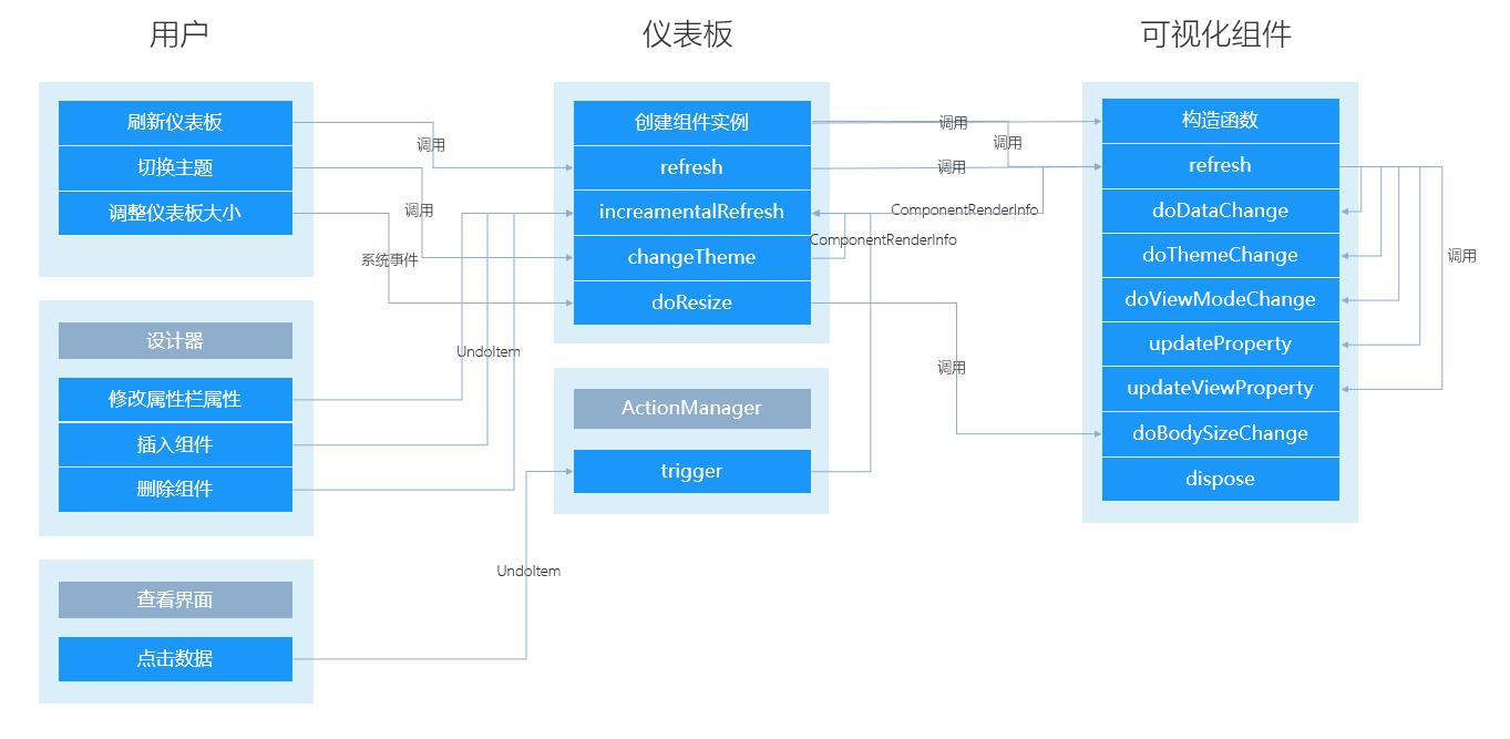
可视化组件开发基于数据驱动UI的模式实现。组件提供一系列方法,如refresh、doThemeChange等,当相应的数据变化或事件触发时(如仪表板初始化时数据查询完成或用户点击了某个条件输入组件时),仪表板将调用组件的相应方法,并传递数据给组件进行渲染。
下图描述了如何在仪表板中处理一些常规的事件和用户操作。
# 实现 Builder
DashboardComponentBuilder用于装载和保存可视化组件的元数据。通常无需继承它,仪表板会使用默认的builder实现。
当遇到如下的情况时,可以继承builder:
- 实现设计器中个性化的属性联动。如文本组件双击字段到数据区中时,自动在文本的
value中插入字段。
DashboardComponentBuilder的继承关系如下:
AnaComponentBuilder -- 分析模块组件元数据对象基类,持有组件的元数据和编译信息。
├───DashboardComponentBuilder -- 仪表板组件元数据对象基类。
│   ├───DashboardInputComponentBuilder -- 仪表板输入组件元数据对象基类。
# 实现 Component
DashboardComponent用于实现组件UI的渲染。
继承DashboardComponent的组件有更大的灵活性,可以通过覆盖基类的方法改变组件的默认实现。
# DOM结构
可视化组件的DOM结构包括title、bg和body。扩展开发在body中实现。
<!-- 组件根DOM -->
<div id="bar1" class="bar-base dashcomponent chart-default sef69865c711">
    <!-- 组件背景 -->
    <div class="dashcomponent-bg"></div>
    <!-- 标题根DOM -->
    <div class="dashcomponenttitle title-title s0b825ade6c9">
        <!-- 标题背景 -->
        <div class="dashcomponenttitle-bg"></div>
        <!-- 标题内容 -->
        <div class="dashcomponenttitle-body">
            <span class="dashcomponenttitle-caption">标题</span>
        </div>
    </div>
    <!-- 组件内容 -->
    <div class="dashcomponent-body">
        ...
    </div>
</div>
# 继承 DashboardComponent
DashboardComponent是组件的基类,提供了和仪表板交互的属性和方法。
DashboardComponent的继承关系如下:
AnaComponent -- 分析模块组件基类。处理了组件的通用渲染流程。
├───DashboardComponent -- 仪表板组件基类。
│   ├───DashboardVisualComponent -- 仪表板可视化组件基类。
│   ├───DashboardInputComponent -- 仪表板输入组件基类。
│   ├───DashboardContainerComponent -- 仪表板容器组件基类。
通常我们开发的是可视化组件,所以继承DashboardVisualComponent会更方便。
在main.ts中编写如下代码,可以使用vis创建一个时间线组件。
import "css!./main.css";
import "css!./lib/vis-timeline-graph2d.min.css";
import { VisualTimeline } from "./lib/vis-timeline-graph2d.min.js";
import { parseDate, Component, waitAnimationFrame, ComponentArgs, dispatchResizeEvent } from "sys/sys";
import { DashboardVisualComponent } from "ana/dashboard/dashboard";

export class VisTimeline extends DashboardVisualComponent {

	private timeline: VisualTimeline;

	protected renderBody(): void {
        // 调用`getOrCreateInnerComponent`方法自动创建`InnerComponent`
        let timeline = this.timeline || (this.timeline = new VisualTimeline({ domParent: this.getDomContent() }));
		//获取数据区定义的查询对应的查询结果,如果有多个查询需要传入query参数
		let dataView = this.getComponentData().getDataView();
		let data = this.buildData(dataView);
		timeline.setData(data);
	}

	private buildData(dataView: AnaDataView): JSONObject[] {
        //遍历dataView,生成vis时间线所需的数据结构。
        return [];
	}

}
# 渲染组件 - renderBody
可视化组件必须实现renderBody方法。该方法提供绘制可视化内容的能力。
 	protected renderBody(): void {
        // 渲染组件内容
		this.getDomBody().innerHTML = 'Hello World';
	}
# 适应大小变化 - doBodySizeChange
如果组件大小发生变化时需要做相应的处理,则需要实现doBodySizeChange方法,否则不需要实现此方法。
    protected doBodySizeChange(): void {
		//super.doBodySizeChange()会刷新组件。
    }
# 适应主题变化 - doThemeChange
仪表板主题变化时会调用组件的doThemeChange方法。DashboardComponent中默认实现了该方法,子类通常无需覆盖。
    protected doThemeChange(): void {
		//super.doThemeChange()会刷新组件
    }
# 适应设计器编辑和预览切换 - doViewModeChange
仪表板在设计和预览界面切换时,会调用组件的doViewModeChange方法。DashboardComponent中默认实现了该方法,子类通常无需覆盖。
当组件的设计器状态和预览状态不一致时,需要覆盖该方法。如tabbar组件在预览界面可以切换选中,当切换回设计器时,需要还原选中状态为默认值。
    protected doViewModeChange(): void {
        //super.doViewModeChange()会渲染组件的设计状态和大小
    }
# 设计器中增量更新组件状态 - updateProperty
仪表板设计器中,用户操作属性栏修改组件属性时,会调用组件的updateProperty方法。实现该方法可以增量渲染组件,提升渲染性能。不实现会刷新组件。
	public updateProperty(undoItem: AnaUndoItemInfo) {
		if (undoItem.op === UndoOperationType.Modify) {
			switch (undoItem.p) {
				case PropertyNames.PrefixIcon:
				case PropertyNames.PrefixIconColor:
				case PropertyNames.PrefixIconSize:
					return this.renderIcon();
				case PropertyNames.IconPosition:
					return this.renderIconPosition();
			}
		}
		// 基类中会处理一些基本属性的渲染方式,若是基类中也没有该属性的处理,则会触发组件全量渲染
		super.updateProperty(undoItem);
	}
# 查看界面增量更新组件状态 - updateViewProperty
仪表板查看界面中,组件数据发生变化时,会调用组件的updateViewProperty方法。实现该方法可以增量渲染组件,提升渲染性能。不实现会刷新组件。
	protected updateViewProperty(undoItem: SuperPageUndoItemDataInfo): void {
		let p = undoItem && undoItem.p;
		if (p === PropertyNames.Value) {
			this.setValue();
			return;
		}
		super.updateViewProperty(undoItem);
	}
# 用户交互
可视化组件可以通过AnaActionManager进行交互。在组件上绑定特定的事件,如click,然后在回调函数中执行triggerActions,触发在设计器中交互面板中定义的交互。
	protected triggerAction(event: MouseEvent, triggerType: ActionTriggerType): void {
			let actionManager = this.renderer.getActionManager();
			let data: ActionDataInfo[] = [];
			let row = this.getComponentData().getParentRow(), compBuilder = this.compBuilder;
			let compId = compBuilder.getId();
			data.push({
				id: compId,
				value: row && row.getProperty(compBuilder, PropertyNames.Value)
			});
			actionManager.triggerActions({
				compId: compId,
				value: data,
				currentRow: row,
				event: event,
				triggerType: triggerType
			});
	}
# 参考
# 获取组件数据
组件数据通过getComponentData()返回的AnaComponentDataSet获取。
// 获取组件是否选中的属性
let selected = this.getComponentData().getProperty('selected');
# 输出组件样式
组件样式分为三种,按优先级从低到高分别为:默认样式、主题样式、自定义样式,这三种样式都会输出到组件的Containner和InnerComponent上,可以通过css样式输出的样式基类已经处理,组件需要实现的是那些无法通过css样式直接输出的样式,例如:图标前后缀。
具体步骤如下:
配置组件需要输出样式的属性列表,见cssProperties。
当
Containner上有不能通过css样式直接输出的样式时,需要重写renderContainerStyle方法处理。当
InnerComponent上有不能通过css样式直接输出的样式时,需要重写renderInnerStyle方法处理,示例:{ protected renderInnerStyle(): void { super.renderInnerStyle(); this.renderIcon(); } private renderIcon(): void { let comp = this.getCompBuilder() as DashButtonBuilder; let icon: IconInfo = comp.getPrefixIconInfo(PropertySource.All); let styleConvertor = comp.getBuilder().getStyleConvertor(); icon && icon.color && (icon.color = styleConvertor.convertColor(icon.color)); icon && icon.image && (icon.image = styleConvertor.convertAttachmentPath(icon.image)); let url = this.compBuilder.getBuilder().getImageService().getIconOrSVGUrl(icon); let button = <VisualButton>this.innerComponent; button && button.setIcon(icon, url); } /** * 返回图标前缀信息。 * @param style */ public getPrefixIconInfo(styleSource: PropertySource, options?: CssPropertyOptions): IconInfo { let prefixIconValue = this.getPropertyFrom(PropertyNames.PrefixIcon, styleSource, options); let prefixIconColor = this.getPropertyFrom(PropertyNames.PrefixIconColor, styleSource, options); let prefixIconSize = this.getPropertyFrom(PropertyNames.PrefixIconSize, styleSource, options); let v: IconInfo = { color: prefixIconColor, fontSize: prefixIconSize }; if (prefixIconValue === 'none' || !prefixIconValue) { if (prefixIconColor === undefined && prefixIconSize === undefined) { v = undefined; } else { v.code = 'none'; } } else if (prefixIconValue.code) { v.code = prefixIconValue.code; } else if (prefixIconValue.image) { v.image = prefixIconValue.image; } return v; } }
# 支持组件的条件样式
组件的状态样式有不同的影响范围时需要配置条件样式影响范围,详细配置见conditionStyleEffectRange,示例:
{
    "conditionStyleEffectRange": { component: ["basic", "axis", "legend"], dataDefinition: ["dataDefinition"]   }
}
配置管理条件样式的属性栏组件,其中
conditionTypes表示组件支持的条件样式类型,默认是突出显示,示例:{ "propertyName": "conditionStyles", "propertyType": "conditionList", "captionVisible": false, "conditionTypes": [ConditionalFormattingRuleType.CellIs] }如果条件样式是交给
InnerComponent处理的,则需要重写renderInnerConditionStyles方法,获取条件样式信息后设置给InnerComponent,如列表:{ /** * 渲染条件样式。 */ protected renderInnerConditionStyles(): void { let tableBuilder = this.tableBuilder; tableBuilder.clearCondFmts(); let conditionStyles = this.compBuilder.getConditionStyles(); for (const conditionStyle of conditionStyles) { let conditionStyleInfo = clone(conditionStyle.toJSON()); let ruleBuilder = conditionStyle.getRule(); let effectRange = conditionStyleInfo.effectRange; .... // 省略的这部分代码是在获取条件样式中表达式的的相应计算结果 !isEmpty(effectRange) && tableBuilder.addCondFmt(conditionStyleInfo); } } }有的样式无法通过css样式输出,例如图标前后缀,这时候需要重写
renderInnerConditionStyles方法,通过getPropertyFrom方法获取生效的条件样式信息后,自行渲染条件样式,示例:{ /** * 渲染条件样式。 */ protected renderInnerConditionStyles(): void { // 基类会默认输出那些能输出为css样式的条件样式 super.renderInnerConditionStyles(); this.renderConIcon(); } private renderConIcon(): void { let comp = this.getCompBuilder() as DashButtonBuilder; let conditionStyleIds = this.getConditionStyles(); let icon: IconInfo = comp.getPrefixIconInfo(PropertySource.ConditionStyle, { conditionStyleIds: conditionStyleIds }); let styleConvertor = comp.getBuilder().getStyleConvertor(); icon && icon.color && (icon.color = styleConvertor.convertColor(icon.color)); icon && icon.image && (icon.image = styleConvertor.convertAttachmentPath(icon.image)); let url = this.compBuilder.getBuilder().getImageService().getIconOrSVGUrl(icon); let button = <VisualButton>this.innerComponent; button && button.setIcon(icon, url); } /** * 返回图标前缀信息。 * @param style */ public getPrefixIconInfo(styleSource: PropertySource, options?: CssPropertyOptions): IconInfo { let prefixIconValue = this.getPropertyFrom(PropertyNames.PrefixIcon, styleSource, options); let prefixIconColor = this.getPropertyFrom(PropertyNames.PrefixIconColor, styleSource, options); let prefixIconSize = this.getPropertyFrom(PropertyNames.PrefixIconSize, styleSource, options); let v: IconInfo = { color: prefixIconColor, fontSize: prefixIconSize }; if (prefixIconValue === 'none' || !prefixIconValue) { if (prefixIconColor === undefined && prefixIconSize === undefined) { v = undefined; } else { v.code = 'none'; } } else if (prefixIconValue.code) { v.code = prefixIconValue.code; } else if (prefixIconValue.image) { v.image = prefixIconValue.image; } return v; } }
# 支持组件的状态样式
组件的状态样式有不同的影响范围时需要配置状态样式影响范围,见conditionStyleEffectRange。
配置管理状态样式的属性栏组件,其中
effectTypes表示组件支持的状态样式类型,示例:{ "propertyName": "conditionStyles", "propertyType": "conditionList", "captionVisible": false, "saveTheme": true, "effectTypes": [EffectStyleType.Selected, EffectStyleType.Busy, EffectStyleType.Hover, EffectStyleType.Active, EffectStyleType.Disabled] }有的样式无法通过css样式输出,例如图标,这时候需要监听组件的相应事件,然后当相应的事件被触发时,通过
addEffectStatus、removeEffectStatus方法增删相应的状态样式状态,通过getPropertyFrom方法获取到生效的状态样式信息后,进行渲染,示例:{ /** * 处理mouseover事件。 */ private doMouseover(event: SZEvent, btn: VisualButton): void { this.addEffectStatus(EffectStyleType.Hover); this.renderEffectStylesDynamic(); } /** * 处理mouseleave事件。 */ private doMouseleave(event: SZEvent, btn: VisualButton): void { this.removeEffectStatus(EffectStyleType.Hover); this.renderEffectStylesDynamic(); } private renderEffectStylesDynamic(): void { let styleInfos = this.getEffectStyleInfos(); let button = <VisualButton>this.getInnerComponent(); let compBuilder = <DashButtonBuilder>this.compBuilder; let validStyles: string[] = this.getValidEffectStyles(); let icon: IconInfo = comp.getPrefixIconInfo(PropertySource.EffectStyle, { conditionStyleIds: validStyles }); let styleConvertor = comp.getBuilder().getStyleConvertor(); icon && icon.color && (icon.color = styleConvertor.convertColor(icon.color)); let url = compBuilder.getBuilder().getImageService().getIconOrSVGUrl(icon); button && icon && button.setIcon(icon, url); } /** * 返回图标前缀信息。 * @param style */ public getPrefixIconInfo(styleSource: PropertySource, options?: CssPropertyOptions): IconInfo { let prefixIconValue = this.getPropertyFrom(PropertyNames.PrefixIcon, styleSource, options); let prefixIconColor = this.getPropertyFrom(PropertyNames.PrefixIconColor, styleSource, options); let prefixIconSize = this.getPropertyFrom(PropertyNames.PrefixIconSize, styleSource, options); let v: IconInfo = { color: prefixIconColor, fontSize: prefixIconSize }; if (prefixIconValue === 'none' || !prefixIconValue) { if (prefixIconColor === undefined && prefixIconSize === undefined) { v = undefined; } else { v.code = 'none'; } } else if (prefixIconValue.code) { v.code = prefixIconValue.code; } else if (prefixIconValue.image) { v.image = prefixIconValue.image; } return v; } }
# 引入第三方组件库
在扩展的目录中可以包含第三方组件的资源,如JS、CSS、图片等。如引入visjs,目录结构如下:
datav
├───package.json
├───main.ts
├───main.less
└───lib
	├───vis-timeline-graph2d.min.js
	└───vis-timeline-graph2d.min.css
在main.ts中,导入对应需要的类:
import { VisualTimeline } from "./lib/vis-timeline-graph2d.min.js";
import "css!./lib/vis-timeline-graph2d.min.css";

...

protected renderBody(): void {
	let network = new VisualTimeline({ domParent: this.getDomContent() });
}